
Lou Mitchell's — a 1923 Chicago diner with a homepage as bright as its French toast
Lou Mitchell's has served breakfast and lunch on West Jackson Boulevard since 1923: Gold Cup coffee, meltaway pancakes, jumbo omelettes, in-house baking, and the tradition of doughnut holes and Milk Duds handed to every guest. The website carried a century of history in the old way: a slideshow hero, award logos, celebrity photos, a long text menu and eight navigation tabs. The brief was clear: keep the recognisable handwritten logo as the only script lettering, use crisp white, vivid red and deep evergreen with large Inter type and bright editorial food photography, and no retro diner graphics. The homepage opens on 'Good morning, Chicago.' beside a plate of French toast, states the four facts that matter (since 1923, baked in-house, breakfast and lunch until 2 PM, takeout and dine-in), shows the three menu categories as photographed cards, the plates that come out of the kitchen, the lunch and story bands, opening hours, and the address with directions and the ChowNow order link. A second page carries the full menu with prices in readable columns. The same system went onto the Google listing, an Instagram grid of six posts, the storefront, uniforms and takeout packaging.
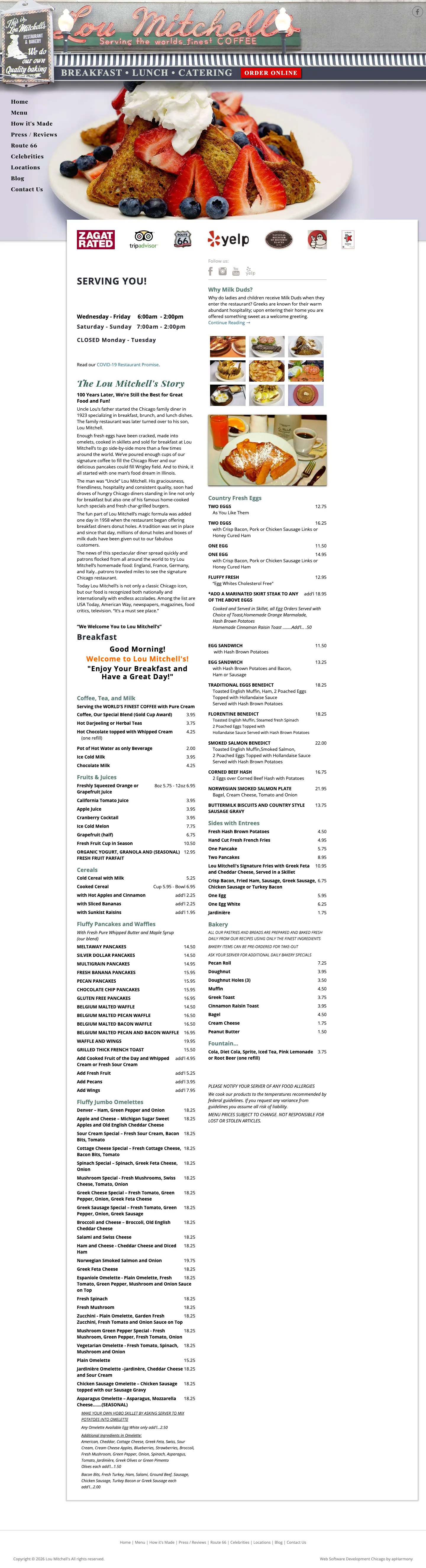
The old homepage led with a slideshow of dishes under a strip of award and press logos, then 'Since 1923' history paragraphs, celebrity photos, a Route 66 badge and eight tabs of navigation. The menu was a long text list with prices, hours were on a separate contact page, and on a phone the page ran to ten screens before the address. The order link existed but sat below all of it.
Website concept as designed, with a motion layer and a larger hero photograph added on request. Hours, address, phone, founding year and menu prices come from the restaurant's official site; the food photographs are generated concept images awaiting the owner's approval. Ordering, directions and reviews open the restaurant's real external services; nothing is booked or sold on the concept itself.
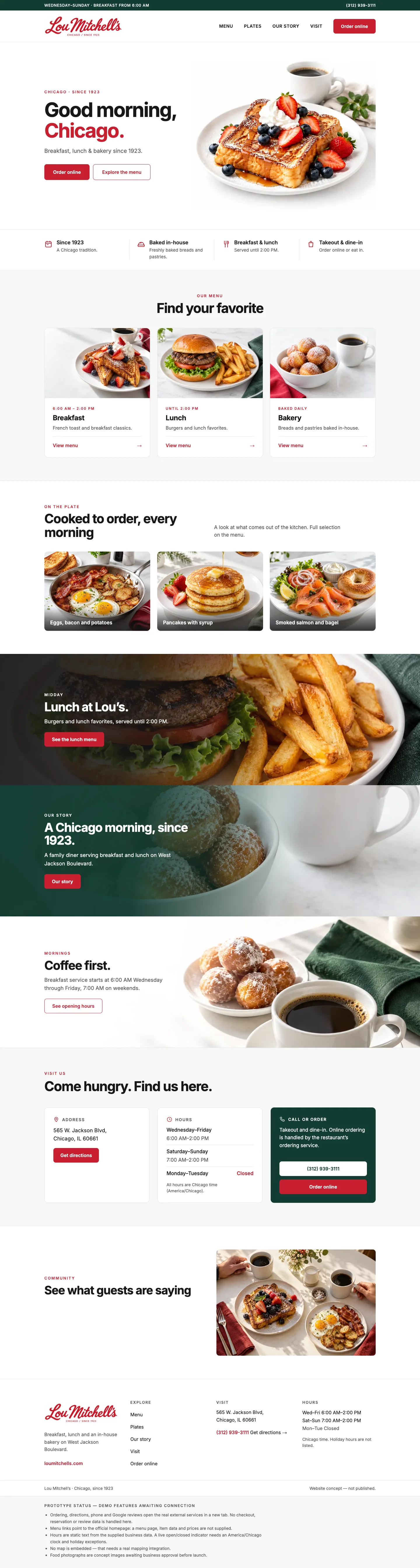
The website: Good morning, Chicago.
Crisp white, vivid red and deep evergreen, large Inter headlines, and bright food photography carrying every section. Two pages: a homepage built around ordering, hours and the menu categories, and a full menu page with every price. A gentle motion layer brings sections in as you scroll, and the hero plate now fills its half of the screen.
- Green top bar with the opening days and the phone; white header with the handwritten logo, Menu, Plates, Our story, Visit and a red 'Order online' that goes to the restaurant's ChowNow page
- Hero: 'Good morning, Chicago.' with Chicago in red, 'Breakfast, lunch & bakery since 1923', Order online and Explore the menu, beside the French toast plate enlarged to fill its column
- Four facts in a row: since 1923, baked in-house, breakfast and lunch until 2 PM, takeout and dine-in
- Find your favorite: Breakfast, Lunch and Bakery as photographed cards with hours and a View menu link
- On the plate: eggs, bacon and potatoes; pancakes with syrup; smoked salmon and bagel — the kitchen as a gallery
- Lunch at Lou's band on the burger photograph; the evergreen story band, 'A Chicago morning, since 1923'; the 'Coffee first' band with breakfast hours
- Come hungry. Find us here: address with directions, hours by day with Chicago time noted, call and order buttons in an evergreen card
- See what guests are saying, linking to the Google profile; white footer with the logo, hours and the concept marker; sticky Order online on phones
- Full menu page: coffee, fruits and juices, cereals, pancakes and waffles, omelettes, country fresh eggs, sides, bakery and fountain, every item with its price, plus the Milk Duds story and pre-order note
The hero with the enlarged French toast plate, the red 'Chicago', two actions and the four facts underneath.
Breakfast, Lunch and Bakery as photographed cards with hours and View menu links.
Eggs, bacon and potatoes, pancakes with syrup, smoked salmon and bagel, then the Lunch at Lou's band.
The evergreen story band with the doughnut holes and coffee, then 'Coffee first' with the breakfast hours.
Address and directions, hours by day, and the call-or-order card in evergreen.
The Google reviews link beside the breakfast table photograph, and the footer.
The second page: categories as chips, every dish with its price, the bakery pre-order card and the Milk Duds story.
Brand: the handwritten logo, renewed around it
The red script 'Lou Mitchell's' is the one thing everyone in Chicago recognises, so it stays as the only script on anything. Around it: white, Signal red #C8202F and Evergreen #123C32, Inter for every other word, four line icons for coffee, breakfast, bakery and Chicago, and a red half-circle as the graphic device.
The handwritten logo in red with 'Chicago / Since 1923' in spaced capitals — refreshed, not redrawn.
Palette (red, white, evergreen, charcoal), the Inter headline 'Good morning, Chicago.', and the four icons.
The storefront sign on West Jackson: the script logo on white with 'Breakfast · Lunch · Bakery' and the evergreen blade sign.
The window graphics and sign seen from the sidewalk.
Coffee cups, a takeout box and the 'Breakfast & Lunch' menu folder.
Menu, cup, box and pastry bag on the counter.
White and evergreen tees and a black apron with the script logo.
Google Business Profile
With thousands of reviews, the listing is the restaurant's front door for visitors. The concept puts the new cover on it — the logo, 'Breakfast. Lunch. Bakery.' and the French toast — so the card matches the site people land on next.
The Google Maps card with the new cover and avatar, hours and the West Jackson address.
'Lou Mitchell's · Chicago / Since 1923 · Breakfast. Lunch. Bakery.' beside the French toast and coffee.
Instagram: good morning, Chicago
A launch grid where each post owns one plate and one line: Good morning, Chicago; Coffee first; French toast; A little sweet; Lunch at Lou's; Worth waking up for. Red and evergreen, the script logo small, food filling the frame. Highlights for Breakfast, Coffee, Bakery, Lunch and Visit mirror the site.
Bio with the address and site, five highlight covers and the first grid of six posts.
The skillet of potatoes, eggs and bacon with the coffee cup.
The Gold Cup coffee on red, the logo cup and saucer.
Berries and whipped cream, the takeout bag behind.
The doughnut holes in the branded basket — the tradition since 1958.
The char-grilled burger and fries on the red counter.
Syrup pouring on the pancakes, the checked napkin.
AI automations: a host who never leaves the door
Lou Mitchell's has a line out the door on weekend mornings and a phone nobody can answer at 8 AM. The automation plan adds a host that answers the questions guests ask before they come, and keeps the regulars coming back.
- Guest assistant in the site: hours today, wait expectations, menu questions from the full menu data, allergy notes, and a hand-off to the ChowNow order link
- Bakery pre-orders taken in chat — pecan rolls, doughnuts, muffins — with pickup time, stored as a lead with a reference and sent to the kitchen
- Catering enquiries collected with date, headcount and menu preferences, forwarded to the owner instead of the general inbox
- Review requests after a visit to keep the rating growing, and a reply draft for every new Google review
- Missed-call text-back during the morning rush with today's hours and the order link
- Instagram and Facebook message replies from the same knowledge base, so 'are you open Monday?' gets the right answer on every channel
The visit block already carries the facts; the assistant answers them in conversation and on every channel.
With every dish and price on the page, 'how much is the corned beef hash' has an instant answer.
The Bakery card becomes the entry point for pre-orders taken in chat and confirmed by the kitchen.
Other businesses we built this for
 Auto Services
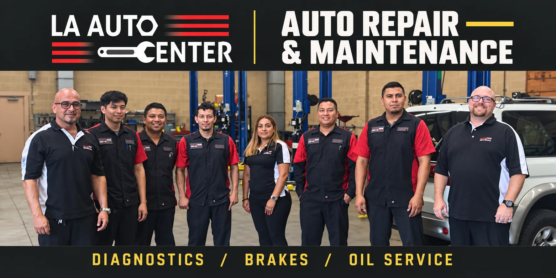
LA Auto Center — a downtown LA repair shop with a site that finally looks like the work
A family shop on W. Washington Blvd since 2009, AAA-approved, 265 Google reviews, and a website of palm trees, a night skyline banner, car-brand logos and yellow text on black. We kept the red-and-white logo, built a graphite-and-yellow identity around it, and made a homepage that shows the real bays, the real team and the real tow truck, with one action everywhere: call the shop.
 Clinics & Dental
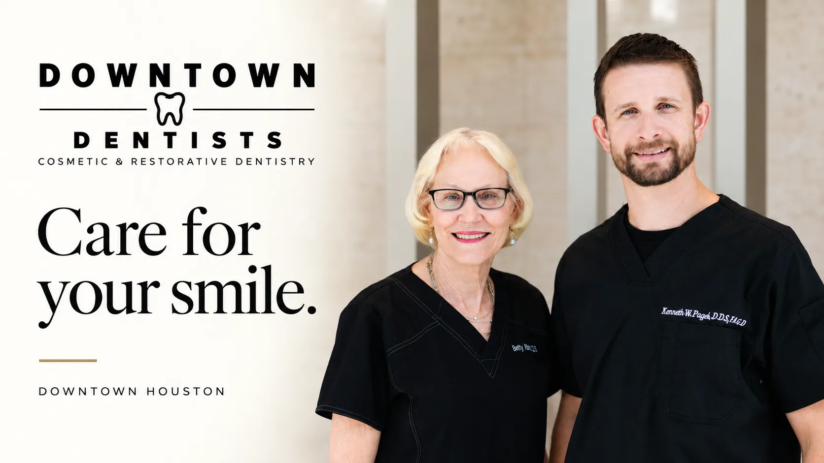
Downtown Dentists — a Houston practice with a site as considered as its care
Two experienced dentists on the first floor of Allen Center, CEREC same-day crowns, SureSmile and Zoom, and a navy template website with a captcha form and a 'Personal. Advanced.' headline. We designed a cream-and-ink identity with a gold hairline and a homepage that reads like the practice feels: care, technology, people, first visit, gallery, reviews, office, visit.
 Service Business
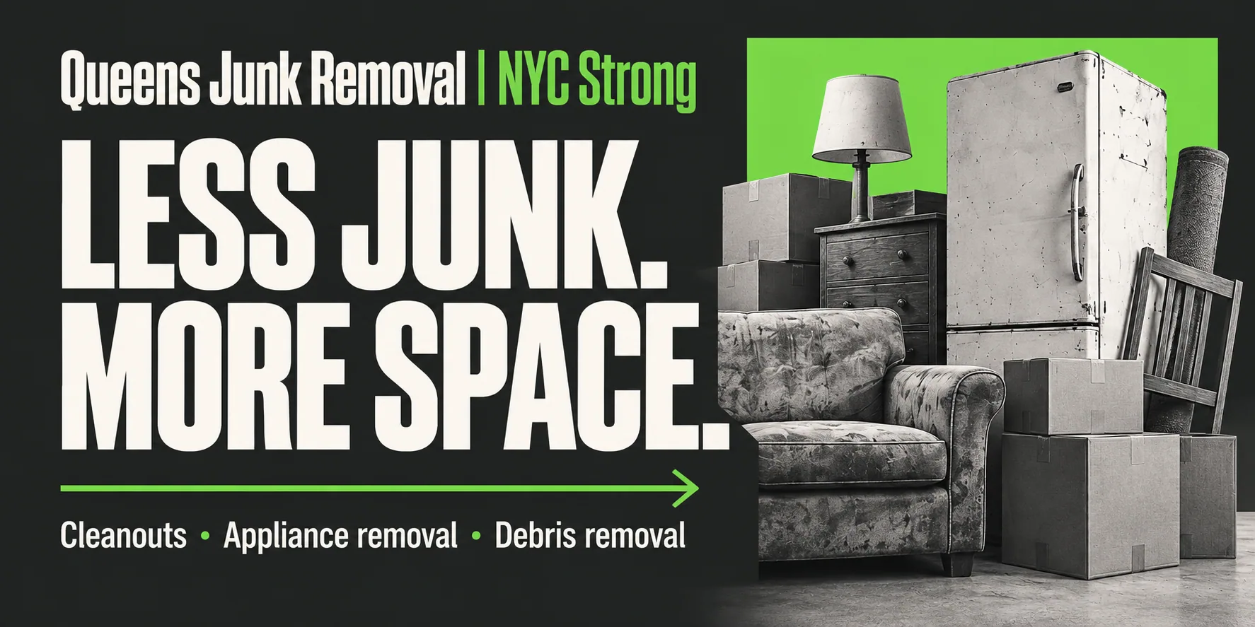
Junk Removal Queens — flat prices on the page and a pickup booked in two minutes
A ten-year-old Flushing hauler with a website that opened on a cartoon truck, 'Call Today!' as the only action and no prices. We gave it a forest-and-lime identity, a site that tells you the price before you call, an assistant that books a 2-hour pickup window at any hour, and a Google cover and Instagram grid that say the same thing in the same voice.
Want this for your business in Los Angeles?
One team for the website, the brand, Google, social and the AI that answers. Fifteen minutes on a call and you leave with a plan and one number, in writing.



Same playbook as this case: website, brand, Google profile, social and the AI receptionist, delivered by one team and tracked in one dashboard.