
Downtown Dentists — a Houston practice with a site as considered as its care
Downtown Dentists has looked after downtown Houston's smiles for years: Dr. Kenneth W. Pagel and Dr. Betty Albers, a team in black scrubs, a bright office in Allen Center, and technology most practices still send out for: CEREC crowns milled in-house, SureSmile aligners, Zoom whitening. The website was a navy dental template: the team photo on the stairs, three bullet points, a long form with a captcha, Google and Yelp logos asking for reviews. We designed an identity around the stacked wordmark and a line-art tooth, cream and ink with one gold hairline, Prata for headlines and Montserrat for everything else, and rebuilt the homepage as an eight-part sequence with real photography of the doctors, the rooms and the work. Every service is a photographed card with its own request link. The same system went onto the Google profile, an Instagram grid of six treatments, the reception sign, stationery and scrubs.

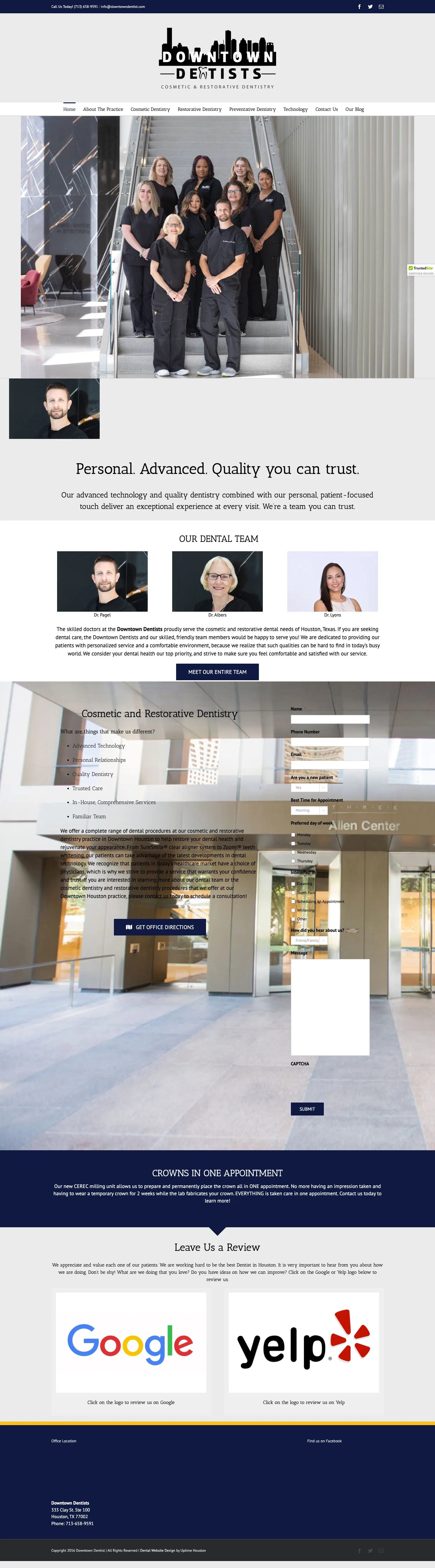
The old homepage opened on 'Personal. Advanced. Quality you can trust.' over a template hero, listed services as bullet points, and asked for an appointment through a seven-field form with a captcha and a 'How did you hear about us?' dropdown. No way to pick a treatment, no photography of the actual work, no hours, and the review section was two logos asking patients to leave one.
Website concept as designed. Doctors, address, phone, email and services come from the practice's current website; the 5.0 rating and 80 reviews come from the brand concept and are to be re-read from the live Google listing before launch; office hours are not published. The appointment form shows a confirmation state only; connecting it to the practice's mailbox or scheduling is part of launch.
The website: Care for your smile.
Cream and ink, one gold hairline, Prata headlines, real photography of the doctors, the rooms and the work. Eight numbered sections in the order a new patient thinks: what you do, how, who, what happens first, proof, where, and how to book.
- Sticky ink header with the stacked live-text logo, the phone at readable size and a cream 'Request a visit' button; full-screen drawer with Prata links on phones
- Hero: 'Care for your smile.' with the gold rule, the two doctors in brand-approved framing and two actions (request, call)
- Ink value band: people, precision, healthier smiles — three lines instead of the rejected icon row
- 01 Care: six photographed service cards (SureSmile, veneers, CEREC, Zoom, implants, preventive), each a link to the request form
- 02 Technology: full-bleed treatment room, then CEREC, SureSmile and cosmetic & restorative as a numbered list
- 03 People: Dr. Albers and Dr. Pagel on dark marble, the clinical team, the full team on the stairs as a bleed
- 04 Your first visit: the front desk photo beside three steps — request, exam and conversation, your plan
- 05 Gallery of the work and the rooms; 06 Reviews with the Google rating; 07 Allen Center with directions; 08 Visit with address, phone, email, an embedded map and the appointment form
- Sticky call / request bar on phones
The hero on travertine cream: eyebrow, Prata headline, gold rule, one sentence and the two doctors; the ink value band underneath.
Six treatments as photographed cards with a one-line description and a gold 'Request' label.
The treatment-room bleed, then CEREC, SureSmile and cosmetic & restorative dentistry as a numbered list beside the heading.
Dr. Betty Albers, Dr. Kenneth W. Pagel and the clinical team as square portraits with credentials, the team on the stairs below.
The ink section: the front desk on one side, request, exam and plan on the other, with the cream button.
Six square tiles of the work and the rooms, with the Instagram link.
The 5.0 rating with stars, the review count, the Google link and what patients mention.
The building exterior beside the address and a real Google Maps directions link.
Address, phone, email and the embedded map on the left; the appointment form with the treatment select on the right.
Brand: stacked wordmark, one gold line
The identity is quiet on purpose: DOWNTOWN over two hairlines with a line-art tooth, DENTISTS underneath, 'Cosmetic & restorative dentistry' as the tagline. Cream and ink only, gold as a hairline never a fill, Prata for the words that matter and Montserrat for the rest. It works on a reception wall, a business card and a black scrub top.
Black on white: Downtown, the tooth between two hairlines, Dentists, and the tagline in spaced capitals.
The wordmark in black on the travertine wall of the front desk.
Business cards, a folder and a bag in cream and ink with the tooth mark.
The mark small on the chest and large on the back of black scrubs, matching the team's uniform.
Google Business Profile
Most patients meet the practice on Google Maps first. The listing concept puts 'Care for your smile.' and the two doctors on the cover, the wordmark as the avatar, and the services where the map card shows them.
Google Maps card with the new cover, the avatar, the Allen Center address and the first-floor note.
'Care for your smile.' with the two doctors on the cream ground — the same frame as the website hero.
Instagram: six treatments, one grid
A launch grid where each post owns one treatment: SureSmile, dental implants, porcelain veneers, preventive care, CEREC same-day crowns and Zoom whitening, photographed on travertine and dark stone in the brand's light. Highlights mirror the site: Our team, Services, Our office, First visit, Contact.
Bio with 'Request an appointment', five highlight covers and the first grid of six posts.
The clear aligner on travertine in a raking light.
Three veneers on dark marble with the Prata headline.
A milled crown on black stone — the post for the practice's signature technology.
A patient smile filling the frame, the headline in the lower corner.
The implant and crown on travertine, small caps for the tagline.
Mirror and toothbrush on stone: the routine visit as a still life.
AI automations: an appointment desk for after hours
Dental requests arrive after hours, from a phone, often from someone in discomfort. The automation plan turns the request form into a desk that works while the practice is closed, without changing a pixel of the design.
- Appointment desk in the site: treatment, new or returning patient and a preferred time collected in chat, with 'call now' steering for anyone in pain
- Every request — form or chat — stored as a lead with a reference in the Lead Key portal and emailed to the practice with the full summary
- Instant text confirmation to the patient, then a front-desk confirmation once the slot is booked
- Recall reminders at six months and review requests after each visit from the same patient list
- Missed-call text-back so a busy front desk never loses an after-hours caller
- Insurance and 'how much' questions answered from a script the practice approves, escalated to the desk when they fall outside it
The appointment form is the entry point; the desk collects the same fields in conversation and stores both as one lead type.
Request, exam and plan — the first step is confirmed by text within minutes instead of a call-back the next morning.
Each treatment card links to the request with that treatment named, so the desk knows what the patient wants before it asks.
Other businesses we built this for
 Restaurants & Cafés
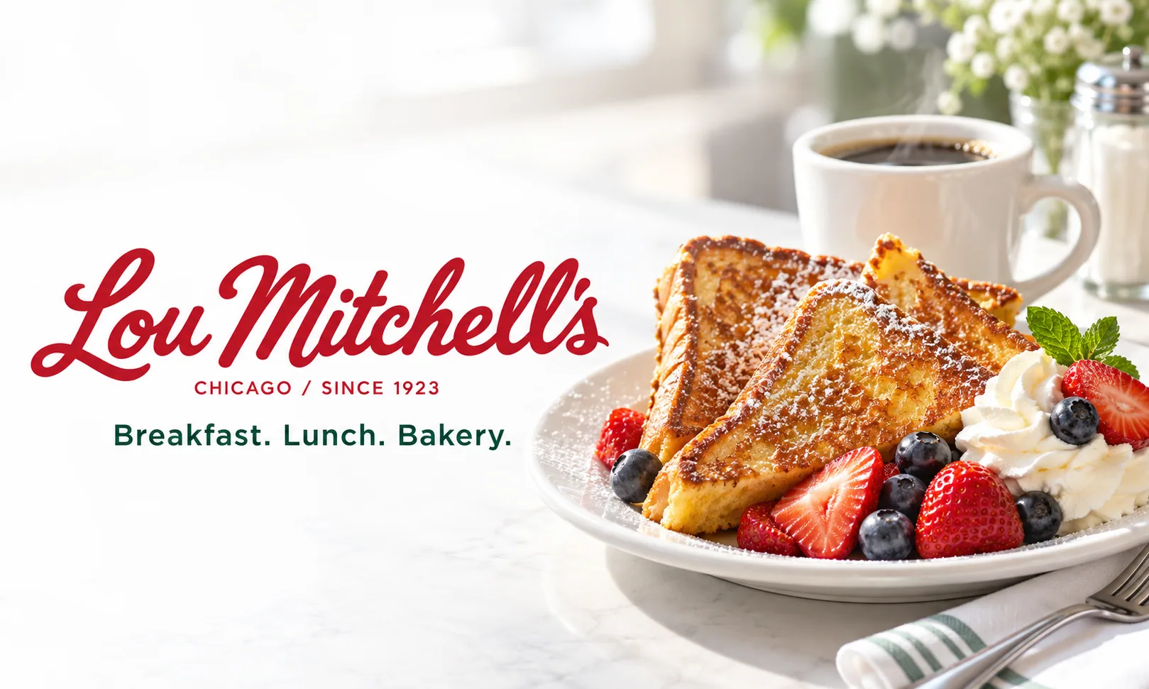
Lou Mitchell's — a 1923 Chicago diner with a homepage as bright as its French toast
A Route 66 landmark since 1923, free doughnut holes at the door, a Gold Cup coffee, thousands of Google reviews, and a website of scrolling banners, award badges and a menu as a PDF-style list. We kept the red handwritten logo, built a contemporary white-red-evergreen identity around it, and made a homepage and a full menu page that load fast and read at a glance.
 Service Business
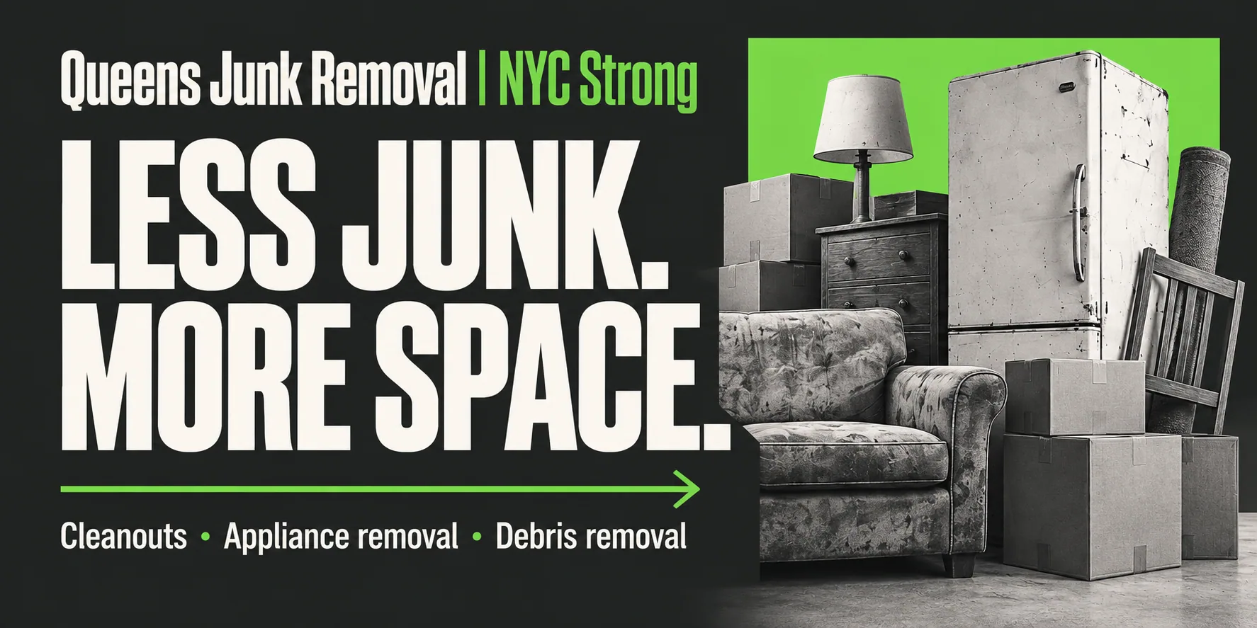
Junk Removal Queens — flat prices on the page and a pickup booked in two minutes
A ten-year-old Flushing hauler with a website that opened on a cartoon truck, 'Call Today!' as the only action and no prices. We gave it a forest-and-lime identity, a site that tells you the price before you call, an assistant that books a 2-hour pickup window at any hour, and a Google cover and Instagram grid that say the same thing in the same voice.
 Auto Services
Vancouver West Motors — a 1966 VW and Audi specialist with a site built like the cars it services
Fifty-nine years on Fraser Street, factory-level VW and Audi tooling, 118 Google reviews at 4.7, and a website from another era: a dark template with a convertible slider, three ribbon buttons and a printable coupon. We gave the shop a graphite-and-silver identity around its three diagonal bars, a cinematic homepage that says 'Your drive. Our craft.', and a launch set for Google and Instagram.
Want this for your business in Los Angeles?
One team for the website, the brand, Google, social and the AI that answers. Fifteen minutes on a call and you leave with a plan and one number, in writing.


Same playbook as this case: website, brand, Google profile, social and the AI receptionist, delivered by one team and tracked in one dashboard.