
LA Auto Center — a downtown LA repair shop with a site that finally looks like the work
LA Auto Center repairs and maintains cars in downtown Los Angeles: diagnostics, brakes, oil changes, A/C, scheduled 30/60/90K service and towing, Monday to Friday and Saturday mornings, with a waiting room and Wi-Fi. The website was a 2010s builder template: a sky-and-palms background, a skyline banner with the name in a serif, a strip of Honda, Chevrolet, Mercedes, Ford and Toyota logos, yellow paragraphs on black and a 'Yelp Reviews' button. We built the identity on the shop's own logo: Graphite #141615, Yellow #E7BC37 and Ivory, condensed uppercase headlines, a set of twelve line icons for the services, and photography of the shop itself. The homepage opens on 'Auto care. Los Angeles.' with the diagnostics tablet, tells visitors how to plan a visit, lets them pick what brought them in, explores every service in one photographic panel, shows the bays, the team and the tow truck, carries the 4.3 rating from Google, answers the common questions, and ends with the address, hours and the phone. The same system went onto the Google listing, an Instagram grid of six service posts, the storefront sign, staff tees and stationery.
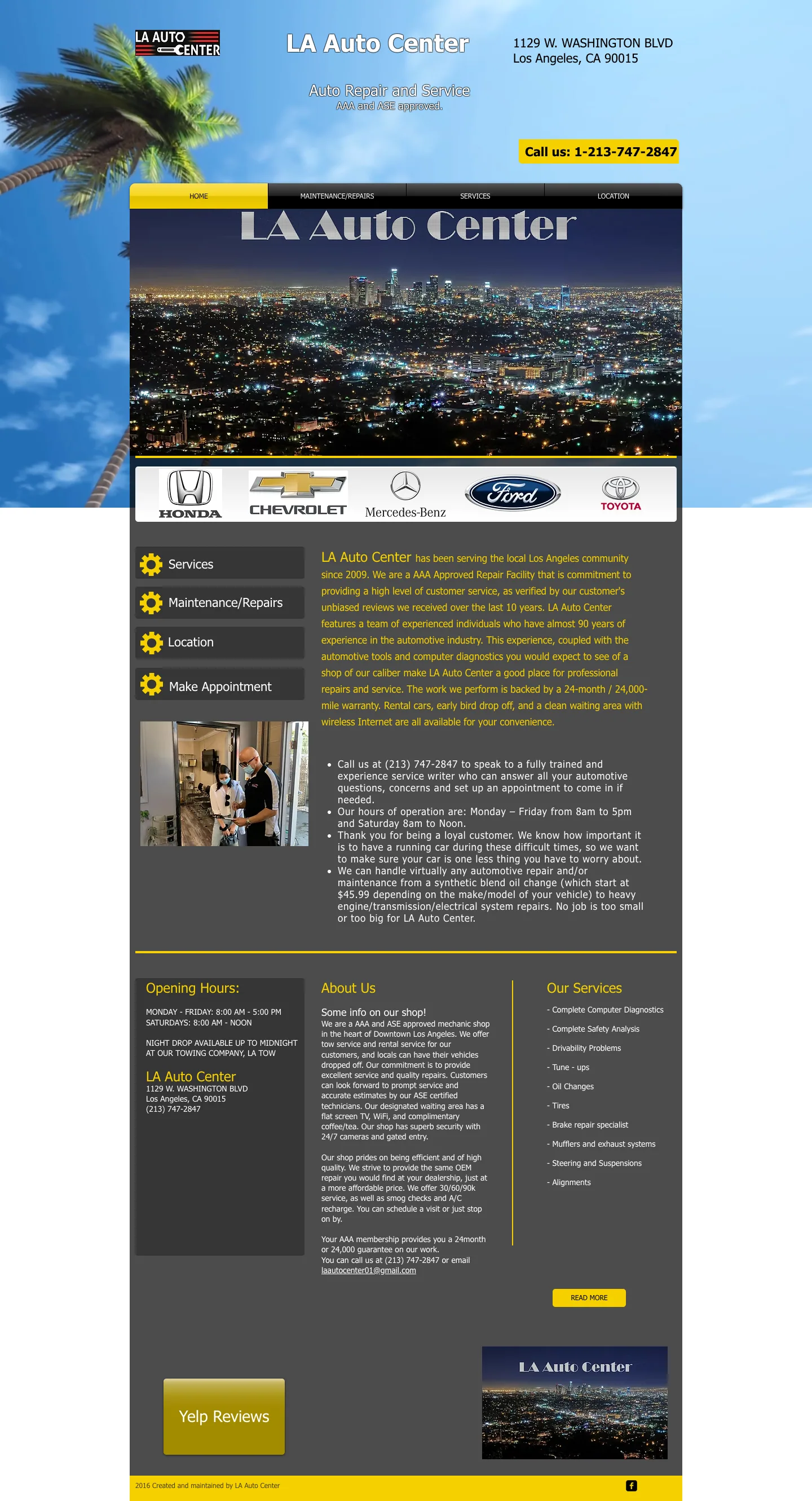
The old homepage opened on a palm-tree sky background with a night-skyline banner, five car-manufacturer logos, and yellow paragraphs on a black panel about AAA approval and a 24-month warranty. Hours sat in a dark box at the bottom, the only actions were 'Call us' and a Yelp button, the service list was plain text, and there were no photos of the shop, the team or the equipment. On a phone it rendered the same fixed layout, shrunk.
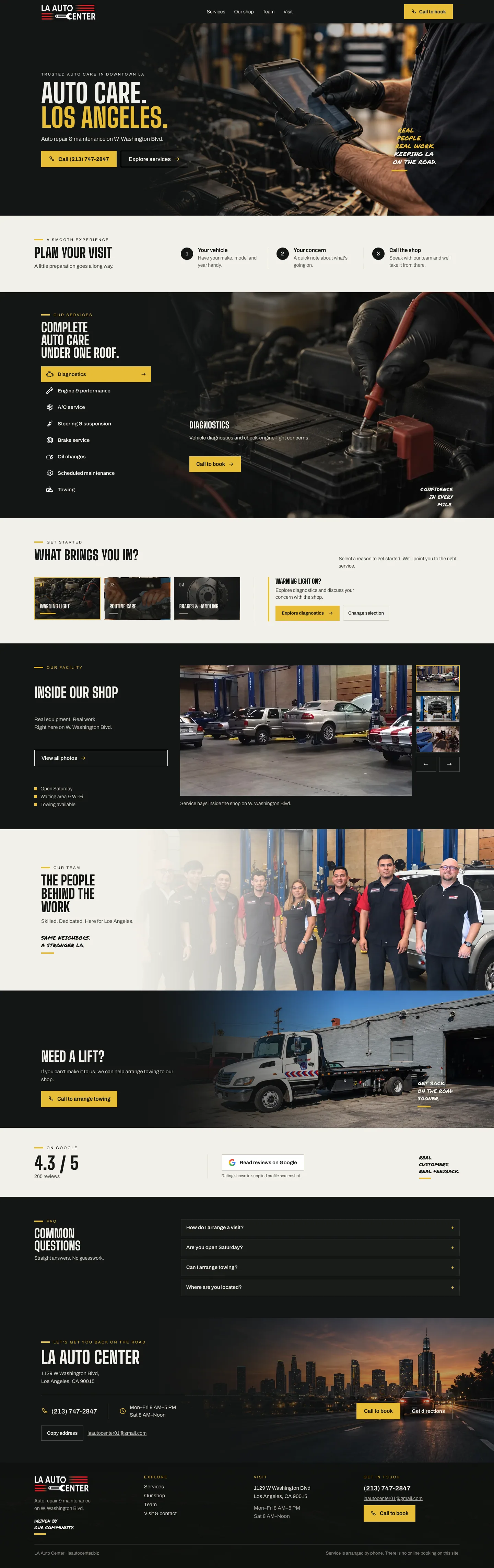
Website concept as designed. Phone, address, hours, email and services come from the shop's current website; the 4.3 rating and 265 reviews are a listing snapshot to be re-read before launch; the team, workshop, waiting-room and tow-truck photographs are the shop's own, the service close-ups are concept images. Service is arranged by phone; there is no online booking on the concept.
The website: Auto care. Los Angeles.
Graphite, yellow and ivory. Condensed uppercase headlines, the shop's real photography, one stroke-icon family for the services, and a phone number that is never more than one tap away. Twelve sections in the order a driver thinks: what is wrong, what you do, where you are, who you are, how to reach you.
- Dark header with the original logo, four anchors and a yellow 'Call to book'; sticky phone bar on mobile
- Hero: 'Auto care. Los Angeles.' over the diagnostics tablet, 'Auto repair & maintenance on W. Washington Blvd.', call and explore actions
- Plan your visit: three steps (your vehicle, your concern, call the shop) instead of a booking form the shop does not have
- Service explorer: eight services as a vertical selector beside one large photographic panel (accordion on phones), each with a short description and 'Call to book'
- What brings you in?: warning light, routine care, brakes & handling, not sure — each routes to the matching service without diagnosing a fault
- Inside our shop: a real-photo gallery of the bays, maintenance and waiting room with the three practical facts (open Saturday, waiting area & Wi-Fi, towing available)
- The people behind the work: the shop's own team photo, uncropped; Need a lift?: the actual white tow truck and 'Call to arrange towing'
- On Google: 4.3 / 5 and 265 reviews with the snapshot note and a link to the listing; four-question FAQ with factual answers
- Let's get you back on the road: address, phone, hours, directions, copy-address and the email on the night-skyline band; footer with the logo
The hero on the diagnostics tablet with the original logo, the two actions and the 'Plan your visit' steps underneath.
The service explorer: eight services as a selector on the left, the chosen one as a large photograph with its description and 'Call to book'.
Four reasons a driver calls a shop; picking one shows the matching service and a call button.
The real bays on W. Washington Blvd with the gallery thumbnails and the three practical facts.
The shop's own team photo, kept whole: 'Skilled. Dedicated. Here for Los Angeles.'
The shop's white flatbed and 'Call to arrange towing' — no dispatch promises the shop cannot keep.
4.3 / 5 on 265 reviews with the link to the listing and the note that the figure is a snapshot.
How to arrange a visit, Saturday hours, towing and the address, answered in one screen.
Address, phone, hours, directions and copy-address on the skyline band, then the footer.
Brand: the original logo, a graphite system around it
The red-and-white 'LA Auto Center' wrench logo stays exactly as it is; the shop's customers know it. Around it: Graphite, Yellow as a short rule and the button colour, Ivory for light sections, condensed uppercase type, and a family of twelve stroke icons for the services in three colours.
The original mark, unchanged: LA Auto Center with the red speed lines and the wrench.
Twelve stroke icons at one weight — warning light, routine care, brakes, diagnostics, engine, A/C, steering, oil, maintenance, towing — in graphite, white and yellow.
The logo on a graphite fascia over the bay doors, 'Auto repair & maintenance' beneath it.
Black tees with the logo on the chest and the back.
Folder, service record clipboard, business cards and a yellow key tag in the same system.
Google Business Profile
With 265 reviews, the listing is where most drivers meet the shop. The cover puts the logo, the promise and the real team on it, so the card matches the site people open next.
The listing as it is: a satellite view and the bare name, nothing that says what the shop does.
The same listing with the new cover and avatar: the team in front of the shop under 'Auto repair & maintenance'.
Logo, 'Auto repair & maintenance', the team, and 'Diagnostics / Brakes / Oil service' in yellow.
Instagram: six services, six posts
A launch grid where each post owns one service and one line: A fresh start (oil change), 30/60/90K (scheduled maintenance), Keep your cool (A/C), Read the signs (diagnostics), Need a lift? (towing), Stop with confidence (brakes). Condensed white type, a yellow service label, the shop's own truck where it fits.
Bio with the address and phone, five highlight covers and the first grid of six posts.
Diagnostics: the scan tool in a gloved hand over the dashboard.
Oil change: the pour into the engine.
Brake service: the caliper on the disc.
Scheduled maintenance on the yellow panel, the bay behind.
A/C service: the vent in the dashboard.
Tow service: the shop's own white flatbed outside the bays.
AI automations: a service writer who picks up every call
Everything at LA Auto Center is arranged by phone, and the phone is busiest when every bay is full. The automation plan turns the site's 'plan your visit' steps into a service desk that takes the vehicle, the concern and a preferred time at any hour and hands the shop a complete request.
- Service desk in the site: vehicle (make, model, year), concern and preferred drop-off collected in chat, with 'what brings you in' mapped to the right service
- Every request stored as a lead with a reference in the Lead Key portal and texted to the shop with the vehicle and concern
- Instant text confirmation to the driver; the shop confirms the visit by phone, as the site promises today
- Towing requests routed first, with the location captured, so the flatbed leaves sooner
- 30/60/90K reminders by text when the interval comes round, and review requests after each visit to keep the 4.3 rating growing
- Missed-call text-back during shop hours, with the address, hours and a link to the request form
The four 'what brings you in' choices are the first question the desk asks.
Vehicle, concern, call the shop: the same three steps collected in conversation and confirmed by text.
A towing request skips the queue and reaches the shop with the driver's location.
Other businesses we built this for
 Manufacturing & B2B
MPL Incorporated — a 30-year electronics contract manufacturer with a website engineers can actually use
An ISO 9001 and ITAR-compliant assembler on Dutch Mill Road since 1991, with a website of stock-photo slideshows, a boxed 2010s layout and a 'Download quote form' button. We kept the navy MPL mark, built a steel-and-navy identity around it, and made an eight-page site where an engineer finds the six services, the quality process and a quote form in one visit.
 Restaurants & Cafés
Lou Mitchell's — a 1923 Chicago diner with a homepage as bright as its French toast
A Route 66 landmark since 1923, free doughnut holes at the door, a Gold Cup coffee, thousands of Google reviews, and a website of scrolling banners, award badges and a menu as a PDF-style list. We kept the red handwritten logo, built a contemporary white-red-evergreen identity around it, and made a homepage and a full menu page that load fast and read at a glance.
 Clinics & Dental
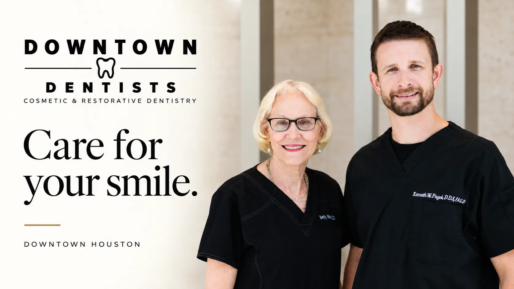
Downtown Dentists — a Houston practice with a site as considered as its care
Two experienced dentists on the first floor of Allen Center, CEREC same-day crowns, SureSmile and Zoom, and a navy template website with a captcha form and a 'Personal. Advanced.' headline. We designed a cream-and-ink identity with a gold hairline and a homepage that reads like the practice feels: care, technology, people, first visit, gallery, reviews, office, visit.
Want this for your business in Los Angeles?
One team for the website, the brand, Google, social and the AI that answers. Fifteen minutes on a call and you leave with a plan and one number, in writing.



Same playbook as this case: website, brand, Google profile, social and the AI receptionist, delivered by one team and tracked in one dashboard.