
Vancouver West Motors — a 1966 VW and Audi specialist with a site built like the cars it services
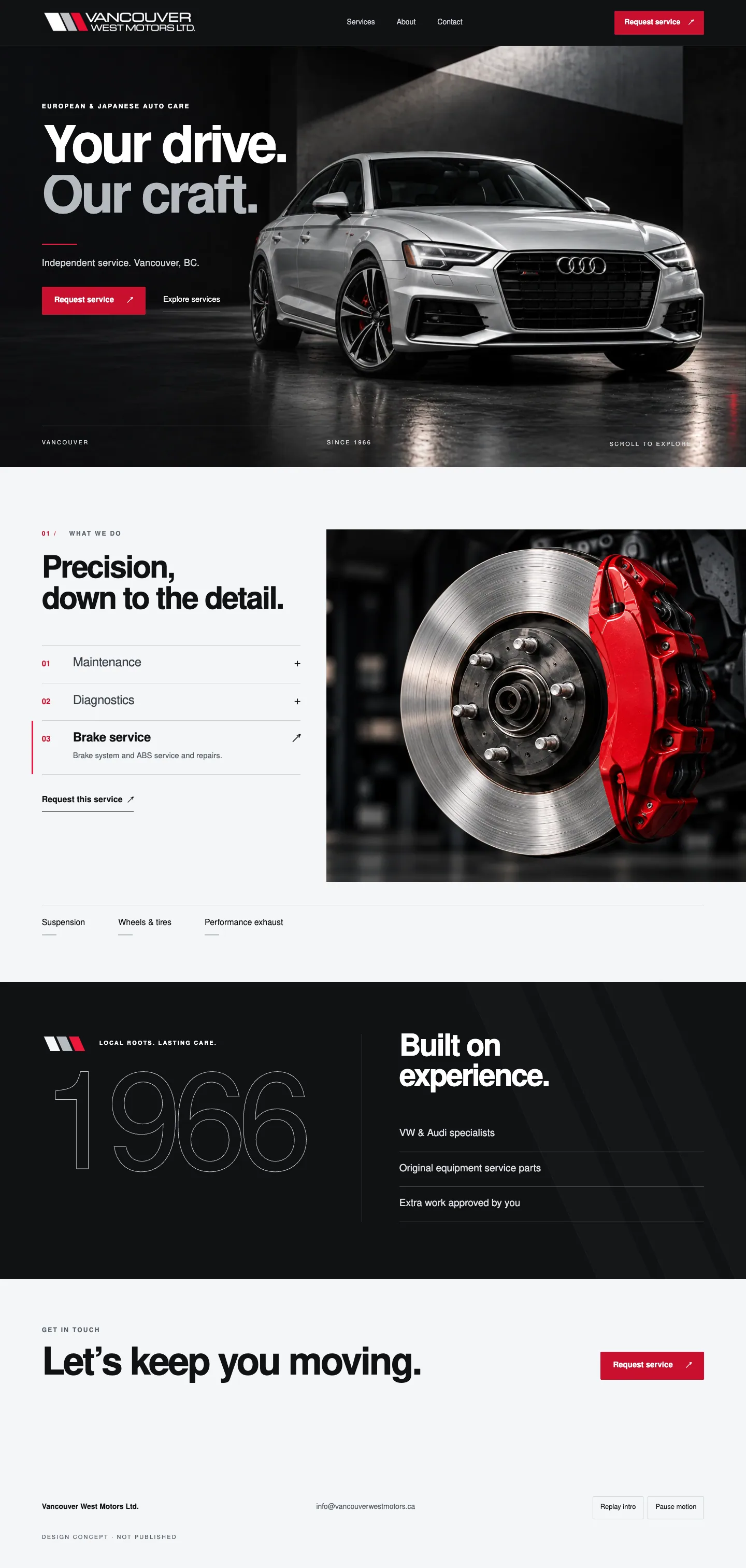
Vancouver West Motors has serviced European and Japanese imports from 8460 Fraser Street since 1966, with a specialisation in Volkswagen and Audi, original equipment parts and a rule that any extra work is approved by the customer first. The website was a dark template: a slider of a VW convertible, 'Celebrating 57 Years in Business' in a script font, three coloured ribbon buttons, a coupon banner, supplier logos and a testimonials page of grey paragraphs. We built the identity on the shop's own three forward-slanted bars: Graphite #131619, Silver #B5BAC0, Cold white #F5F6F7 and a signal red #EC173A used only as a short underline, Nimbus Sans Bold for short service headlines. The homepage is cinematic and quiet: 'Your drive. Our craft.' over a silver sedan, three numbered service selectors that crossfade a large photograph, the founding year 1966 as a huge outlined numeral, the three service principles, and a contact section with the real phone, address, hours and a request dialog. The same system went onto the Google listing, six Instagram posts, the storefront sign, stationery, a next-service card and team apparel.
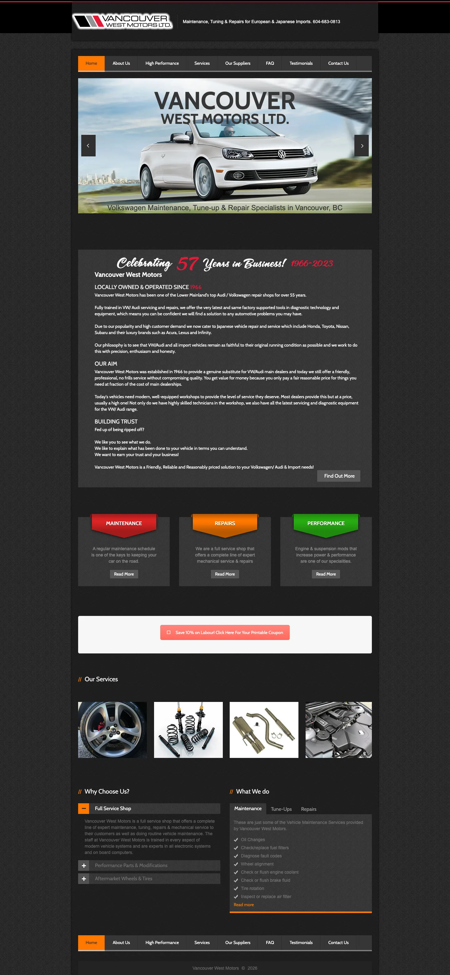
The old homepage opened on a slider of a Volkswagen convertible with 'Volkswagen Maintenance, Tune-up & Repair Specialists in Vancouver, BC', then 'Celebrating 57 Years in Business! 1966-2023' in a red script, three ribbon buttons (Maintenance, Repairs, Performance), a 'Save 10% on labour' coupon, a row of tiny service photos and a wall of grey text. No way to request a service, no photography of the work, hours buried on the contact page, and on a phone it was five screens of paragraphs.
Website concept as designed. Phone, address, hours, founding year and services come from the shop's current website; the 4.7 rating and 118 reviews are a listing snapshot to be re-read before publication. The hero and service photographs are generated concept images, not photos of the shop's work or staff. The request dialog shows a preview state only; connecting it to the shop is part of launch.
The website: Your drive. Our craft.
Graphite, silver and one red rule. Nimbus Sans at generous scale, a cinematic hero, and a service section that changes into a bright editorial split with a large photograph and three numbered selectors. Motion is part of the design: masked headline lines, a settling hero image, scroll reveals and a crossfade when a service is chosen.
- Dark sticky header with the reversed logo, three links and a red 'Request service' button; a drawer with the phone on phones
- Hero: 'Your drive. Our craft.' in oversized type over the silver sedan, 'Independent service. Vancouver, BC.', request and explore actions, 'Since 1966' in the corner
- 01 / What we do: 'Precision, down to the detail.' with Maintenance, Diagnostics and Brake service as numbered selectors that crossfade the photograph, plus links to Suspension, Wheels & tires and Performance exhaust
- Heritage: 1966 as a huge thin outlined numeral beside 'Built on experience' and the three principles — VW & Audi specialists, original equipment service parts, extra work approved by you
- Get in touch: 'Let's keep you moving.' with the phone, 8460 Fraser Street, Monday to Friday hours and the request dialog (name, phone, vehicle, service)
- Reduced-motion respected, pause and replay controls for the intro, no prices, awards or fabricated reviews
The cinematic hero: reversed logo, the promise in oversized Nimbus Sans, the red rule, two actions and the silver sedan.
Three numbered service selectors beside the large photograph; choosing one crossfades the image and opens its description.
1966 as the heritage numeral, 'Built on experience' and the three verified service principles on graphite.
Phone, address, hours and the request button on the bright contact section; the footer with the concept marker.
Brand: three bars, one red rule
The shop already had the three forward-slanted bars. We made them the anchor of a system: Graphite, Silver, Cold white and a signal red kept small; Nimbus Sans Bold for short service headlines; a short red underline for headings and a cropped diagonal pattern for physical materials; six service icons at one stroke weight.
Vancouver West Motors Ltd. with the three bars in graphite, silver and red — the original mark, preserved.
Graphite #131619, Silver #B5BAC0, Cold white #F5F6F7 and Signal red #EC173A: red stays an accent, large areas are graphite or cold white.
The bars, the short red rule, the cropped diagonal pattern and the six service icons.
The wordmark on the existing facade at 8460 Fraser Street, drawn from the real building.
Business cards, a service folder, a next-service card and a key strap in graphite with the diagonal pattern.
Black tees with the chest mark and back print, and a branded cap, shown as a flat lay.
Google Business Profile
With 118 reviews at 4.7, the listing is where most customers meet the shop. The concept puts the new cover and the wordmark on it so the card matches the site people land on next.
The listing as it is: a photo of the storefront window and the number, nothing else to say what the shop stands for.
The same listing with the new cover: 'Your drive. Our craft.' and the silver sedan behind the wordmark.
Landscape cover for Google and Facebook: the wordmark, the promise, 'European & Japanese auto care' and the car.
Instagram: six services, one voice
A launch grid where each post owns one service — Maintenance, Diagnostics, Brake service, Wheels & tires, Suspension, Performance exhaust — with the headline, the red rule and the bars in the corner. Highlights mirror the site: Service, Diagnostics, Brakes, Wheels, Tuning, Visit.
Bio with the address and phone, six highlight covers and the first grid of six posts.
The silver sedan in the underground bay: 'European & Japanese care.'
A scan tool over the engine bay, gloved hand, the red rule under the word.
A red caliper on a fresh disc, the shop's signature colour used where it belongs.
An Audi wheel on wet asphalt, the headline at the bottom.
Springs and shocks on concrete, 'Springs & shocks' in spaced capitals.
Twin tips on a dark car, the bars in the corner.
AI automations: a service desk between the lifts
A four-bay independent shop cannot answer every call while a technician is under a car. The automation plan turns the request dialog into a desk that books service requests, keeps customers informed and brings them back at the right interval.
- Service request assistant in the site: vehicle, service and preferred drop-off collected in chat, with 'extra work approved by you' explained up front
- Every request — dialog or chat — stored as a lead with a reference in the Lead Key portal and sent to the shop with the vehicle and service
- Instant text confirmation to the customer; the shop confirms the appointment by phone, as the site promises today
- Next-service reminders from the brand's next-service card turned digital: a text when the interval or season comes round
- Review requests after each pickup to keep the 4.7 rating growing, and missed-call text-back for calls that land during a road test
- Parts and approval updates by text while the car is on the lift, so 'approved by you' happens in minutes instead of a callback
The request dialog is the entry point; the desk collects the same fields in conversation and stores both as one lead type.
'Request this service' under each selector opens the request with that service named.
The printed next-service card in the client materials becomes a text reminder when the interval comes round.
Other businesses we built this for
 Service Business
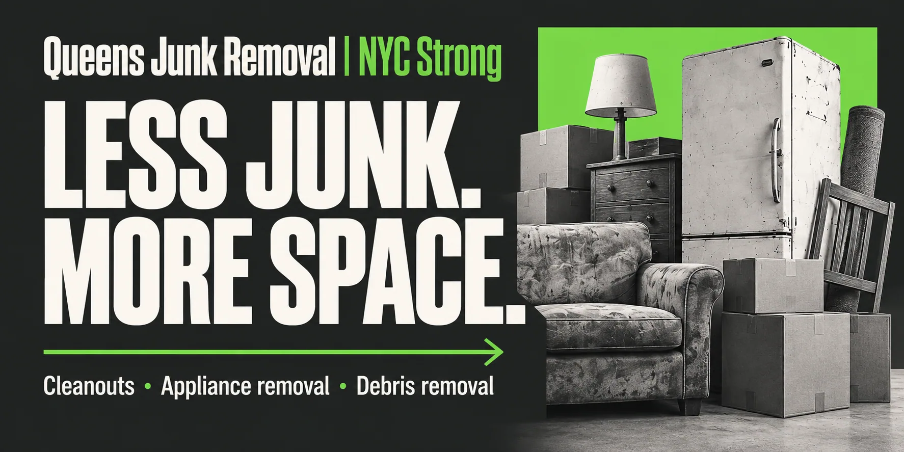
Junk Removal Queens — flat prices on the page and a pickup booked in two minutes
A ten-year-old Flushing hauler with a website that opened on a cartoon truck, 'Call Today!' as the only action and no prices. We gave it a forest-and-lime identity, a site that tells you the price before you call, an assistant that books a 2-hour pickup window at any hour, and a Google cover and Instagram grid that say the same thing in the same voice.
 Service Business
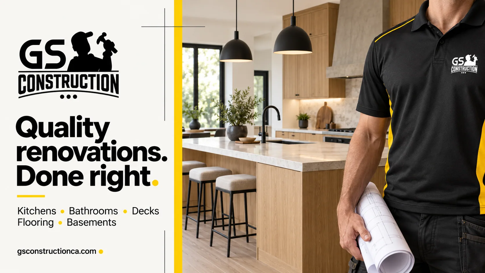
GS Construction — a renovation contractor with a brand you can spot from the driveway
A five-star renovation crew with a good logo and a website that said everything and asked for nothing. We turned the yellow-and-black mark into a full identity, rebuilt the site around one action — get a free estimate — and put a working estimate assistant on it that qualifies the project and books the visit.
 Service Business
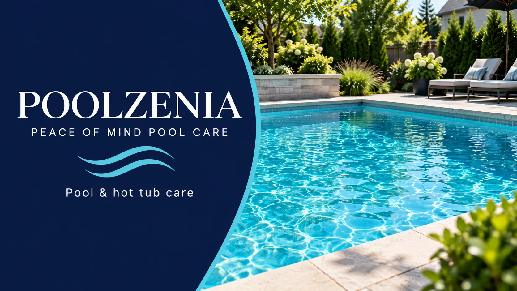
PoolZenia Ottawa — pool care that finally looks like peace of mind
A franchise pool-care company with a 4.8-star Ottawa location and a website that greeted homeowners with a popup and a postal-code box. We built a navy-and-aqua identity around 'Peace of Mind Pool Care', a calm, editorial Ottawa homepage that leads with 'Just swim', a concierge that books the first visit in two minutes, and carried the brand onto the Google cover, the van and an Instagram grid for every season.
Want this for your business in Los Angeles?
One team for the website, the brand, Google, social and the AI that answers. Fifteen minutes on a call and you leave with a plan and one number, in writing.



Same playbook as this case: website, brand, Google profile, social and the AI receptionist, delivered by one team and tracked in one dashboard.