
Zum Straubinger — a Munich Wirtshaus with a brand as warm as its beer garden
Zum Straubinger is a busy Bavarian tavern with a garden in Munich's old town: 3,815 Google reviews at 4.4 stars, winter Eisstockschießen lanes, a takeaway counter and a lunch menu. Online it looked like 2012: a cartoon of a napping Bavarian as the logo, an orange top bar, a blurry facade photo and paragraphs about atmosphere before anything you could book or eat. We built a calm forest-green and cream identity from the tavern's own world — hops in the ZS monogram, a Baskerville headline voice, the diamond pattern of a Bavarian flag — and rebuilt the website around the three things guests come for: the food, the garden and a table. Then we carried the same brand onto the Google listing, an Instagram launch grid, the printed menu, coasters, the takeaway bowl and the team's tees.
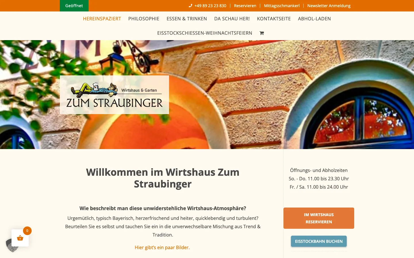
The old homepage opened with a blurry facade photo, an orange bar with the phone number, two competing buttons in different colours and a headline asking 'How do you describe this irresistible atmosphere?'. Opening hours were the main content; the menu, the garden and the reservation were three clicks away. On a phone the first screen was the top bar, a green 'open' badge and a shopping-cart icon.
Showcase build in German, the language of the tavern's guests. Google listing and Instagram visuals are concepts prepared for the owner; the listing screenshots are marked as unpublished concepts.
The website: Bayerisch. Mitten im Leben.
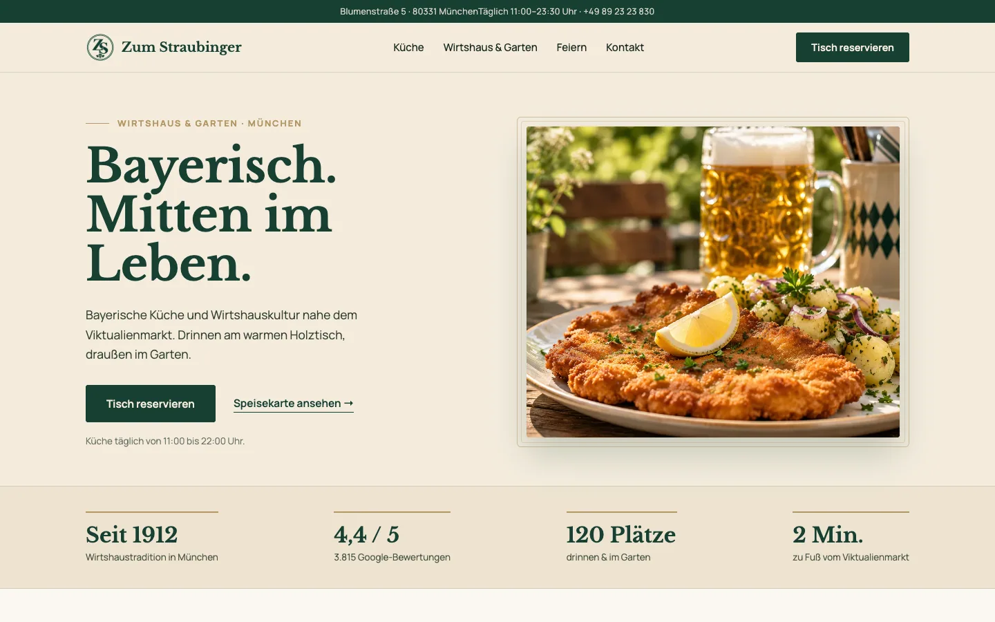
One screen, one promise, one button. The new site opens with the schnitzel, the line 'Bayerisch. Mitten im Leben.' and 'Tisch reservieren', then walks the guest through the kitchen, the tavern and garden, and the plans people make here: celebrating together, winter on the ice lanes, food for home.
- Hero with the tavern's own dish photography and a reservation button above the fold, on desktop and on a phone
- Three trust lines under the hero — regionally rooted, next to the Viktualienmarkt, inside and outside — instead of a paragraph about atmosphere
- 'So schmeckt das Straubi': Wiener Schnitzel, Schweinebraten and a fresh Maß as photographed cards, with the menu one tap away
- 'Ein Platz zum Bleiben': tavern and garden photography with a direct link to each
- 'Für eure Pläne': celebrations for groups up to 30, Eisstockschießen from 11 November, takeaway — each with its own call to action
- Libre Baskerville for headlines, Manrope for everything a guest needs to read fast; forest green on cream, no orange bar
- Mobile-first layout, WebP images, no cookie wall before the first screen
The approved layout on one canvas: hero with reservation, trust line, dishes, tavern and garden, plans. Every section ends in a link, none of them says 'welcome'.
Wiener Schnitzel, Schweinebraten and 'Frisch gezapft' as photographed cards, with the full menu and drinks list one tap away.
The candle-lit Stube and the garden under the trees, each with its own link, and the green menu book as the brand object.
Three reasons to come with a plan: celebrations for groups, Eisstockschießen from 11 November, and 'Für dahoam' takeaway, each with a request link.
Brand: from a napping cartoon to a ZS with hops
The old logo was a cartoon Bavarian asleep with a beer. The new identity is what the tavern actually feels like: Waldgrün #173F32, Creme #F4ECDD and Altgold #B39765, a ZS monogram with a hop cone, Libre Baskerville headlines, a Bavarian diamond pattern and six line icons for Küche, Bier, Garten, Feiern, To go and Eisstock.
A cartoon of a napping Bavarian holding a Maß, with 'Wirtshaus & Garten' in a thin sans — impossible to embroider, print small or put on a sign.
ZS monogram inside a double ring with a hop cone, 'Zum Straubinger' in Baskerville and 'Wirtshaus & Garten' letter-spaced underneath. Works at coaster size and on the facade.
The same mark on the brand's cream — the version used on menus, cards and the website header.
Colours, typography ('Bayerisch. Echt. Gut.' in Libre Baskerville, Manrope for body text), the diamond pattern, the hop motif and the six icons that structure the site and the Instagram highlights.
Green tees for the team, the hanging sign on the facade, the apron in service — the brand where guests actually meet it.
Menu and drinks list in green linen, business cards, beer coasters with the monogram, the kraft bag and the 'Für dahoam' takeaway bowl with the diamond band.
Google Business Profile: the cover people see first
With 3,815 reviews, the Maps listing is the tavern's busiest front door. We designed a set of covers that put the new mark next to the food and the beer, and mocked up the listing so the owner could see the change before publishing.
Concept of the Maps profile: the ZS emblem and schnitzel as the cover next to the map of the old town, 4.4 stars, 'Reservieren' as the primary action. Marked as unpublished concept.
Forest-green panel with the emblem, schnitzel with potato salad and a Maß in the garden light — the main cover for Google and Facebook.
The same dish on the cream side of the brand, for placements where the green would sit on a dark map.
The wordmark over the green-tiled tavern interior with a Maß on the table — the winter and evening cover.
Large Baskerville wordmark with the schnitzel plate — the cover used for the lunch-menu posts.
The green linen menu with the emblem, coaster and a beer — the cover for the menu tab and the 'Speisekarte' post.
Instagram: six moods, one grid
A profile that reads like the tavern — Küche, Bier, Garten, Feiern, To go, Eisstock as highlight covers — and a launch grid that alternates dish close-ups with green typographic posts in the brand's Baskerville.
Bio with the address and 'Tisch reservieren', six highlight covers with the brand icons, and the first six posts in a green-and-cream rhythm.
Kitchen post: the schnitzel with potato salad and lemon, the claim in Baskerville, the 'Küche' tag in the corner.
The beer post: a dimpled Maß at the bar with the green tiles behind it — the one that gets saved.
Garden season: Maß, wine and pretzels under the chestnut trees, the hop leaf as the only decoration.
Celebrations post: a set table by candlelight, then the invitation in green — 'im Wirtshaus'.
Eisstockschießen from 11 November: the stone on the ice lane under string lights — the winter campaign in one frame.
Takeaway post: Schweinebraten with dumpling and red cabbage in the branded bowl, kraft bag behind, diamond band along the edge.
Other businesses we built this for
 Service Business
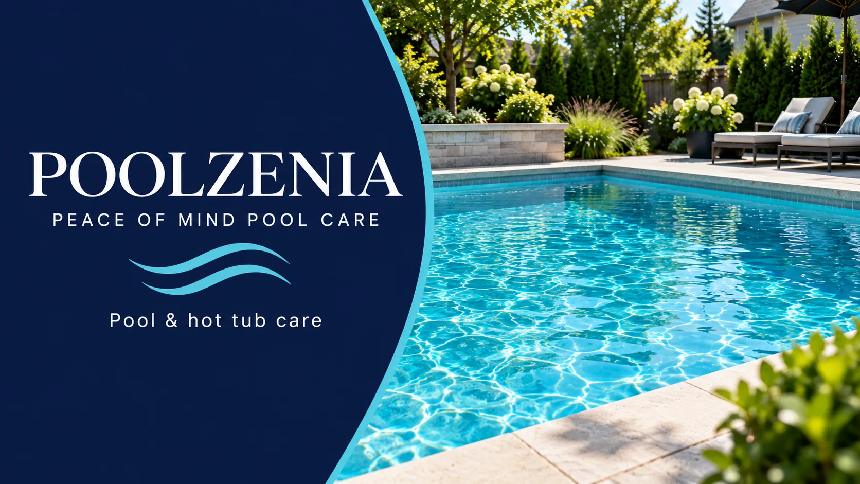
PoolZenia Ottawa — pool care that finally looks like peace of mind
A franchise pool-care company with a 4.8-star Ottawa location and a website that greeted homeowners with a popup and a postal-code box. We built a navy-and-aqua identity around 'Peace of Mind Pool Care', a calm, editorial Ottawa homepage that leads with 'Just swim', a concierge that books the first visit in two minutes, and carried the brand onto the Google cover, the van and an Instagram grid for every season.
 Restaurants & Cafés
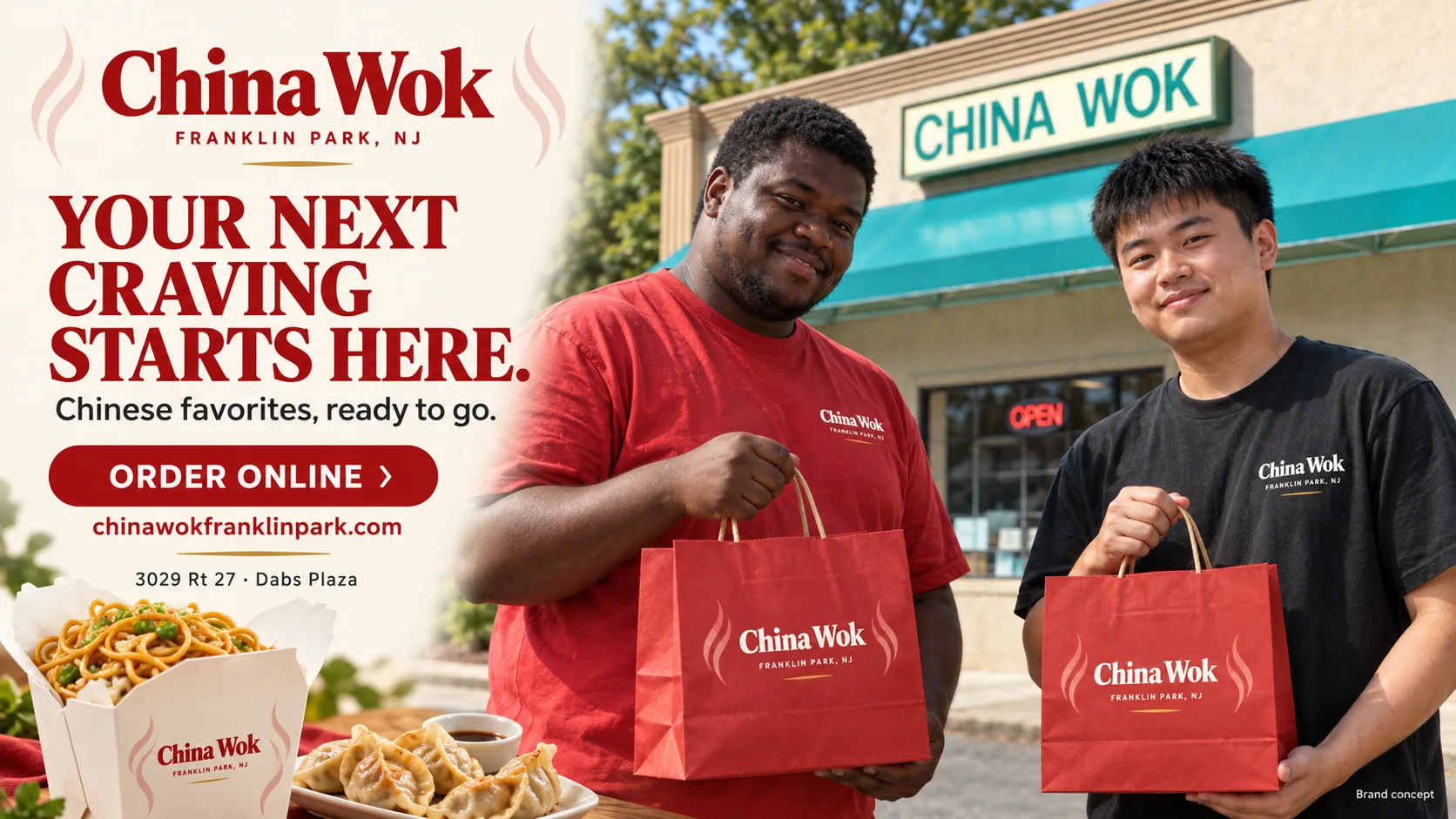
China Wok — a neighborhood Chinese restaurant, rebuilt from the menu up
From a point-of-sale template with six 'Photo' placeholders to a food-first ordering site, a brand on the bags, a Google profile that sells and an AI that answers the phone.
 Service Business
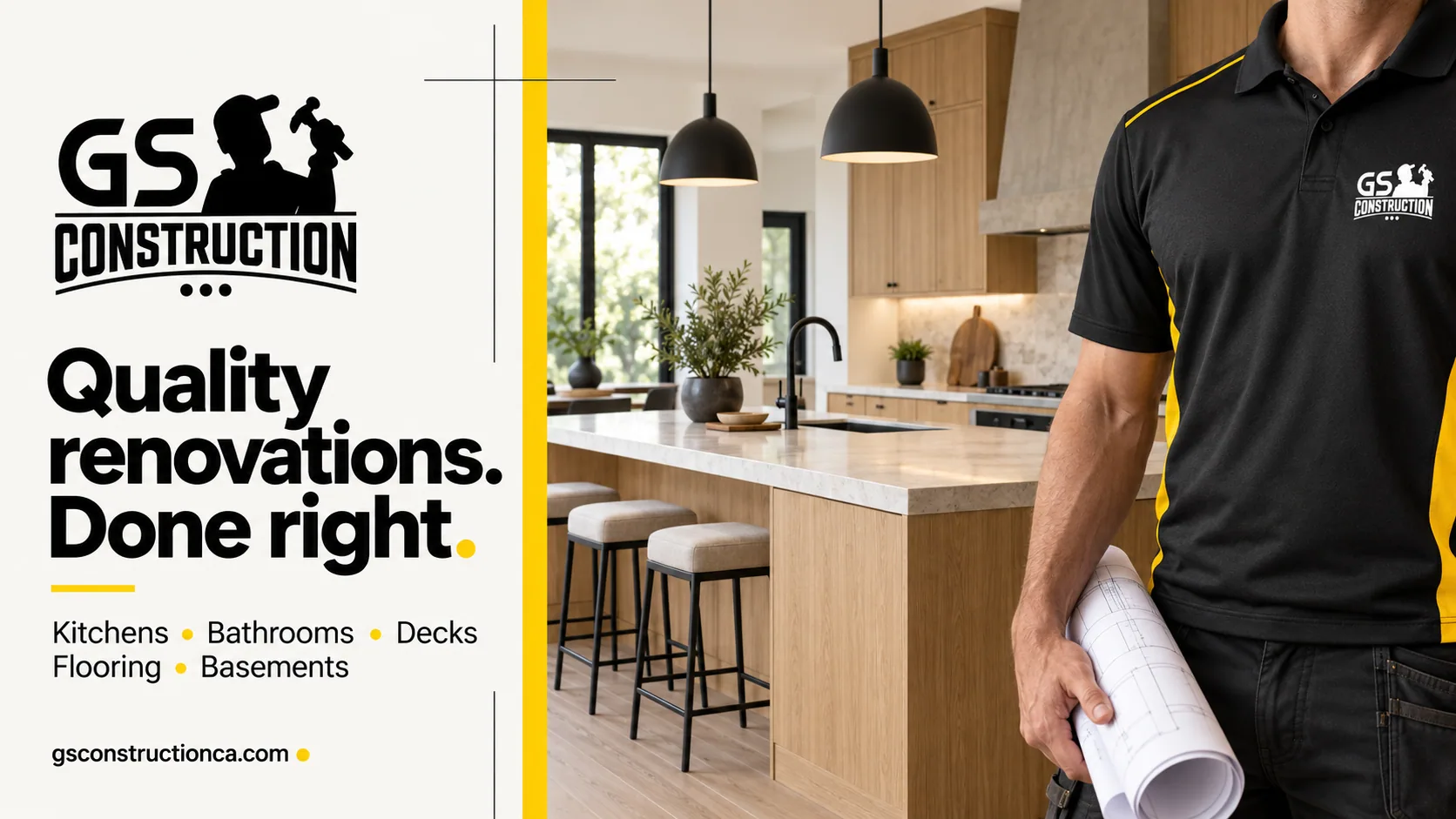
GS Construction — a renovation contractor with a brand you can spot from the driveway
A five-star renovation crew with a good logo and a website that said everything and asked for nothing. We turned the yellow-and-black mark into a full identity, rebuilt the site around one action — get a free estimate — and put a working estimate assistant on it that qualifies the project and books the visit.
Want this for your business in Los Angeles?
One team for the website, the brand, Google, social and the AI that answers. Fifteen minutes on a call and you leave with a plan and one number, in writing.



Same playbook as this case: website, brand, Google profile, social and the AI receptionist, delivered by one team and tracked in one dashboard.